
My post on factorization diagrams from a month ago turned out to be (unexpectedly) quite popular! I got ten times as many hits as usual the day it was published, and since then quite a few other people have created their own variations. The purpose of this post is twofold: first, to round up links to a bunch of the variations, and second, to show off some new and improved factorization diagrams!
I should mention a couple of my inspirations: first, the book You Can Count on Monsters does something similar, though it takes a more artistic and representational approach, in contrast to my strictly geometric approach. My other inspiration was Sondra Eklund’s super-cool prime factorization sweater (and other prime factorization visualizations) which uses a different color to represent each prime.
Not long after I published my original factorization diagrams post, the Internet got right to work creating the obviously needed factorization-diagram-generators. jnop reimplmented them in Javascript on jsfiddle, so you can play around with the code (and generate factorization diagrams) interactively. Alp Mestanogullari created a factorization diagram generator based on my original Haskell code, built with the Happstack web framework. And walrus simply generated the first 2000-some factorization diagrams, making them available for download (see this comment for instructions). Jason Davies also reimplemented factorization diagrams in Javascript, using D3.js.
Lucas linked to this awesome video on Youtube which is sort of related, but is so freaking awesome it really doesn’t matter how related it is, you should go watch it!
The Bayesian Observer made some variant diagrams showing integers as multi-level trees, grouped by prime factors.
Of course, it couldn’t be long before someone had the idea of animating the factorization diagrams. First Sean Seefried created this page with a simple animation of each factorization diagram turning into the next. Most recently, Stephen Von Worley created a much more sophisticated version which is truly wonderful: watching all those dots dance from one factorization to the next is mesmerizing.
Now, on to the improved diagrams! Quite a few people suggested improvements, some of which I’ve adopted here.
> module Factorization2 where
>
> import Math.NumberTheory.Primes.Factorisation (factorise)
> import Diagrams.Prelude
> import Diagrams.Backend.Cairo.CmdLine
> import Data.List.Split  ( chunksOf   )
> import Data.Char        ( digitToInt )
>
> type Picture = Diagram Cairo R2
>
> primeLayout :: Integer -> Picture -> Picture
Layout for 2 is mostly the same as before, except I’ve moved the diagrams a bit closer together, and added some extra calls to things like reflectY and centerX as preparation for the first improvement…
> primeLayout 2 d
>   | width d >= height d = (d === strutY (height d / 3) === d # reflectY)
>                         # centerY
>   | otherwise           = (d ||| strutX (width d / 3)  ||| d)
>                         # centerX
…which is to lay out rotated copies of a subdiagram at the vertices of a 

> primeLayout p d = (mconcat $
>                    iterateN (fromIntegral p)
>                      (rotateBy (1/fromIntegral p))
>                      (d # translateY r)
>                   )
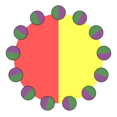
The next improvement is to add color (as suggested by Sjoerd Visscher). Instead of coloring the dots (which might look nice but doesn’t really help visually identify the factorization), we color in the area inside each prime polygon, using a different color scheme for each prime. Actually, there’s only a different color for each digit, and multi-digit primes are shown using vertical bars of color.

>                   <>
>                   colorBars p poly
>   where poly = polygon with { polyType   = PolyRegular (fromIntegral p) r
>                             , polyOrient = OrientH
>                             }
>         w  = max (width d) (height d)
>         r  = w * c / sin (tau / (2 * fromIntegral p))
>         c  = 0.75
And here are the colors I chose. They’re based very loosely on the color code for resistors. I lightened them all up a bit (by blending with white) which I think looks nice.
> colors = map (blend 0.1 white)
>   [black,red,orange,yellow,green,blue,gray,purple,white,brown]

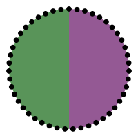
For example, here’s the diagram for 47:
The odd primes up through 

(Incidentally, this accounts for some of the weirdness in the mapping from digits to colors—like why grey comes in between blue and purple—because I wanted all the small primes to have nice colors!)
And here’s the diagram for 
Referring to the table of colors (and it’s not hard to memorize), we can see that 
For completeness, here’s the implementation of colorBars:
> colorBars p poly | p <= 11 = stroke poly
>                              # fc (colors!!(fromIntegral p `mod` 10))
>                              # lw 0
> colorBars p poly = bars # clipBy poly
>   where
>     barColors = map ((colors!!) . digitToInt) (show p)
>     barW = width poly / fromIntegral (length barColors)
>     barH = height poly
>     bars = (hcat $ map (\c -> rect barW barH # fc c # lc c) barColors)
>            # centerX
The code to actually generate complete factorization diagrams is almost the same as before, except I don’t reverse the factors anymore; I think drawing the factors from largest to smallest actually gives more pleasing (and intelligible) diagrams.
> factorDiagram' :: [Integer] -> Picture
> factorDiagram' []     = circle 1 # fc black
> factorDiagram' (p:ps) = primeLayout p (factorDiagram' ps)
>
> factorDiagram :: Integer -> Picture
> factorDiagram = centerXY
>               . factorDiagram'
>               . concatMap (uncurry $ flip replicate)
>               . factorise
To show it off, here’s some code for generating a table of factorization diagrams from 

> fd n = factorDiagram n # scaleUToY 0.8 <> square 1
> table n = vcat . map hcat . (map . map) fd
>         . chunksOf (fromIntegral n) $ [1..n*n]
Here’s 1 to 36 as before:

And here’s 1 to 100 (click for a larger PDF):
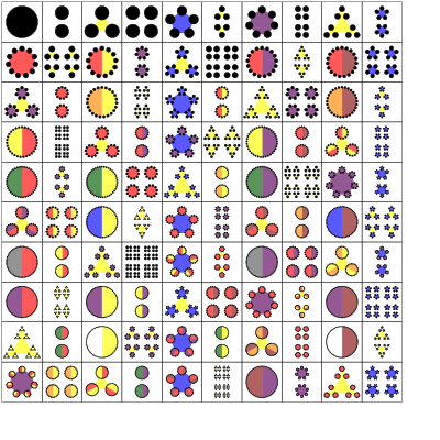
Sweet!
I also want to play with using alternate layouts for certain primes (e.g. centered hexagonal numbers), but that will have to wait for another post since I’m almost out of time.
And yes, I plan to get some posters and/or t-shirts of these printed up. Any suggestions on a good site for that kind of thing? Of course I’ve heard of cafepress but I’m sure there are others and I’m open to suggestions…

The Factor Conga is beautiful, but before I saw it I had a different dance in mind. I was picturing one highly composite number moving between its possible representations. For example, 30 (=2x3x5) can be shown 6 ways, with the smallest clumps being 2, 3, or 5 (and still having two choices for the middle and largest arrangements). I won’t be creating this. Anyone interested?
Oooh, very cool idea! I may try working on it at some point…
I hadn’t thought of coloring the primes according to their digits, but I like it a lot because its not only aesthetically pleasing, but also adds meaning to the diagram, since the large primes are so hard to count. I had tried coloring the factorgrams after your post last month, and went a different direction with it. I think your color version is cooler, but maybe you’ll find this interesting anyway. 😉 https://dl.dropbox.com/u/364079/factorgrams-mult-color.pdf.
For prints, mpix.com is fast and awesome and they have a really nice metallic pearlescent print paper that really goes well with digital art. You probably also have a local Costco, and their prints are perfectly fine and *very* cheap. I had a large 24×36 print made at Costco of the black and white factorgrams that I gave to my son’s school teacher for their class. Its huge and beautiful and cost about $10.
Oh, very cool, I like your idea of arranging them in a multiplication table! And thanks for the info re: prints. I will keep those options in mind if I want to make some nice prints for myself. I’m also trying to figure out options for some sort of “print-on-demand” service where others can order posters and such.
Reblogged this on nebusresearch and commented:
The Math Less Traveled has followed up the factorization diagrams post — rendering visually the integers multiplied together to get an integer — of a month ago with an expansion of the idea. This version includes not just arranging points into regular polygons, and polygons of polygons, but into colored polygons.
At least some of these charts, or charts inspired by them, belong on classroom walls.
I have to disagree about not reversing the factors – The larger numbers are harder to distinguish from each other in general, so making them as large as possible helps. 15 vs. 21 is clearer as five triangles vs. seven triangles than as three small flowers vs. three different small flowers.
Yet another implementation to be added to the list, this time in R. I actually coloured the edges rather than plotting the vertices. Interestingly, it becomes quite a different thing visually. There is also some code for an interactive web app with R… Enjoy http://jean-robert.github.com/2012/11/20/prime-factorization-visualization.html
It’s great to see other people interested in this — I thought I was alone in my obsession with writing code to make prime factorization wheels!
Back in February 2012, I made this poster with LaTeX/TikZ for a few numbers, along with an animated version. The wheels arose while thinking about alternative ways to visualize the Sieve of Eratosthenes.
I’m working now on an application for kids called Primagic (e.g., “prime magic”) which displays factorizations interactively: http://www.facebook.com/Primagic. There are a dozen or so different styles of drawing (dots, dots with lines, circles and polygons with dots, flowers, stars, stained glass, light rays, marbles, etc.) and you can rearrange the factors interactively and browse by thumbnail. I’ll be ready for beta-testers in a couple weeks or so if anyone is interested.
Very cool! I’d be willing to beta-test.
FYI, when I click on the animated version I get “this video is not available”.
That’s odd… I set the video’s permissions to Public. Well, in any case, here’s a higher-resolution version anyway: http://disco.bu.edu/~tsl/The_Beauty_of_Numbers.html. This was from February 21, 2012. And a higher-resolution static image: http://disco.bu.edu/~tsl/prime-factor-chart-radial-200dpi.png. These arose after some work I was doing at the time on factor chains: http://disco.bu.edu/~tsl/prime-factor-chart-384-600dpi.png.
Does this video show ok for you? — https://www.facebook.com/photo.php?v=10101173885805240 — It’s the splash screen with a screen-saver that runs through random number patterns.
Pingback: Newcastle MathsJam November 2012 Recap | cp's mathem-o-blog
I came up with a more compact way to arrange the circles that still looks nice and is easy to generate.
This time round I also wrote my code in Haskell, using Diagrams.
Great package!
Primes (369K)
Factorisation diagrams (5.3M)
More illustrations and the code, with a little bit more information, can be found at https://github.com/vlent/diagrams-contrib.
Second link again: allfactorisations.svg
Very cool!!
Pingback: Factorization diagram cards: help? | The Math Less Traveled